Wednesday, April 30, 2008

IO Design Team Challenge

Guess what? It is time for another Impression Obsession Design Team challenge! This month's challenge was to create a card using "stamps only." By that, we meant that you couldn't use any patterned papers to make your card. Embellishments, however, were allowed.

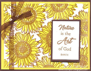
For my card, I used the new Leigh Hannan sunflower head. I know I have said it before, but I just love her stuff! I stamped the flower onto white paper and then colored it with Copic markers. I cut around the flower leaving a small jagged border and layered it onto a strip of green paper. I punched out leaves with the same green paper and attached a yellow tag to finish the card. Here is a close-up of the stamp:

Make sure to check out the other designer blogs to see what they made. Bernadette, Daniela, Julie, and Penny are all planning on participating. Remember, because of all the time zones, there will be posting all day Wednesday. I hope you enjoy what we created!

Sunday, April 27, 2008

Envelope Challenge

Before I start talking about the today's card, I have to mention a blog candy opportunity where you can win some great new Impression Obsession stamps. This month's contest is being hosted by Penny, so head on over to her blog and check out what you can win! Penny is such a talented artist, and you will love the samples she made using the stamps you can win. Don't worry, if you win the contest, you will get brand new stamps. :) I had to start this post with the contest because if you know me, you know I am all about winning stuff (and doing little happy dances when I do win).

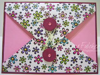
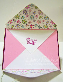
Today's card is one I made for the latest Hero Arts blog challenge. The challenge was to create a card using envelopes somewhere on the card. For my card, I cut the flaps off of two white envelopes with a little bit of the front of the envelopes still attached to the flaps. I glued part of the flaps under the pink cardstock so that when you unwind the wax linen, the white flaps open to reveal a message underneath. The stamped flowers are actually a floral border I stamped over and over to create a background. I colored the flowers with my Copic markers and popped up two dark pink disks that serve as the closure to the card. Here is what the card looks like when opened:

I didn't actually color the flowers on the inside of the flaps. Because I used Copic markers, the ink bled through the paper to the inside of the card. I used more white envelope flaps on the inside to leave a space to write a message. This project turned out the be a great way to use up some old envelpes!

Thursday, April 24, 2008

Bluebird

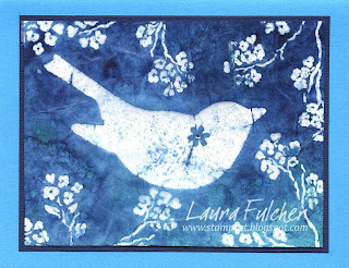
Today I am posting a card using one of my favorite techniques. It involves mulberry paper, clear embossing powder and Colorwash sprays. The technique was originated by Mitra Friant, owner of Impression Obsession, many years ago and has gradually evolved to incorporate various inks and sprays. Although the mediums may have changed, the basic technique remains the same.

To create this card, I stamped some of the newer IO images onto mulberry paper using VersMark ink and embossed them with clear embossing powder. I spritzed the paper with various shades of Colorwash sprays and then removed the embossing powder with an iron (make sure you put the mulberry paper between newsprint to do this step). I then layered the blue mulberry paper onto white cardstock so that the bird and cherry blossoms really popped. I added additional layers of blue cardstock and placed a rhinestone on the bluebird to finish the card. This technique is easy, but VERY messy! If you would like to see more samples of the batik technique, I am including a link to some of Mitra's samples.

I want to apologize to anyone who was watching my blog to see if my Clear Cards class still had room in it. It filled before I even realized it. I am just now marking it as full. Sorry if you didn't make it in this particular class, but I will be teaching it again in late May or early June. I also added two more sessions of my intro Copics class in May. Sorry for the inconvenience!

Monday, April 21, 2008

More Simple Stamping

I am running out of cards from my Virtual Stamp Night. What am I supposed to do when they are gone? Create something new?! That seems rather drastic. Ah well, I don't have to worry about it tonight.

This card is from the "lots of flowers" challenge and uses one of my new Impression Obsession clear stamp sets. What makes it a quick card is that each flower is made with two stamps. I inked the bottom layer with yellow and stamped it onto glossy paper. I found that glossy paper worked a lot better than white cardstock in showing off the yellow color of the flower. I then inked the outline stamp in brown and stamped it over the yellow. It was really nice to not have to color each flower with markers or pencils. I added a saying and ribbon to finish the card. Very quick and easy!

Thursday, April 17, 2008

Stand Out in a Crowd

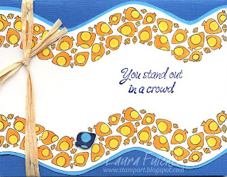
Recently, I made a couple of cards with my new "stand out in a crowd" stamp from Impression Obsession. The first card I made was for a birthday (hence the need for a balloon). I thought it worked well given that the recipient likes birds. However, it wasn't my best idea for a sample card because I pulled the birds from an IO Valentine's Day set. I didn't realize that the birds weren't sold separately. I just thought the birds were so sweet.

The second card uses one of the new Leigh Hannan images for summer. The funky fish were fun to color, but now I am wishing I had colored the majority of fish blue and the one fish yellow/orange in keeping with the wave of the paper. What do you think?


Tuesday, April 15, 2008

Back to Cards

I thought I would get back to posting some cards after my brief departure into decorating plants. Today's card is another Virtual Stamp Night Challenge. This particular challenge was paper piecing. To do this technique, you first stamp onto a plain color of cardstock and then you stamp your image again onto patterned paper. For this particular card, I cut out the dress stamped on patterned paper and glued it onto the white cardstock that was stamped with the dancer. Very easy! It is such a great way to use up some of your patterned paper scraps. Oh! I almost forgot. The dancer is by Stamping Bella and the saying is by Impression Obsession.

Monday, April 14, 2008

Something Just Not Right

Well, my blog banner does say this is the place to see what is going on in my crafting life. I guess that includes the random, bizarre stuff I make as well as the cards.

Recently, Saturday Night Live had a skit with Christopher Walken called "Indoor Gardening Tips From a Man who is Very Scared of Plants." The basic premise of the skit is that if you put googly eyes on plants, they aren't as scary because you can make eye contact with them.

I am not sure at what point I turned weird. Was it at the beginning when I thought the odd SNL sketch was funny? Was it when I decided to make a googly-eyed plant for my friend Chrisi's birthday? Was it at Whole Foods when I picked a plant that was sloped on one side because I figured googly eyes would attach better on it than a rounded plant? Was it at Michaels when I was walking around with my plant in hand in order to pick out the correct size of googly eyes? Was it when I was standing by all my adhesives trying to figure out the best one to use to attach googly eyes to a plant? After all, you don't want the eyes to fall off (gross), but you don't want to hurt the plant either. (author's note...Ranger's pop dots work great!) I guess it doesn't really matter. There is something just not right with me.

On a related note, as you can see from my picture, googly-eyed plants aren't scary at all. The only down side is that you feel obligated to name them. I told Chrisi she would have to pick a name for her new plant. It is her decision, but I am leaning towards Carmen in honor of Carmen Miranda. The stems with buds remind me of Carmen's fanciful hats. Seriously, there is something just not right with me.

Thursday, April 10, 2008

Simple Stamping

Today I am posting another card from last weekend's Virtual Stamp Night. The task was to create a simple card. For this challenge, you could only use one stamp and one saying. You could use any ink you wanted, but you could only use two colors of paper (as well as white or cream). There were also limits as to how many tools and embellishments you could use. I decided to go the simple route and not use any.

I chose the leaf stamp from Impression Obsession for a couple of reasons.
1. It is one of my new stamps, and I hadn't played with it yet.
2. It is a large stamp that filled up a lot of space. That sure made designing a lot easier!

I inked the leaves stamp with Versafine Olympia Green on the bottom and Versafine Deep Lagoon on the top. You really need Versafine with this stamp to pick up the detail. I stamped the leaves and saying onto white cardstock, cut them out, and layered them. I finished the card really early and had time to lounge after this challenge. Believe me, when you are doing a marathon of challenges, any spare time is a blessing.

I checked splitcoaststampers tonight and saw that this card was chosen by the challenge hostess as a challenge honoree. I am so pleased that it was chosen from all the entries! I also have to give a shout out to my friend Tami who had her paper piecing card honored. Notice that I wrote piecing and not piercing here, Tami (pardon the inside joke everyone).

Finally, I have to mention that a card I did was on Hero Art's blog today. My card was chosen at random from all the clear card participants. I guess you can say that in this case, I was a lucky stamper instead of a talented one. It really doesn't matter; it was cool to see it on their blog. My card looked like this:


Speaking of challenges, we have been handing out fliers at Angela's highlighting the upcoming Inkadinkado contest. If you are participating, please give Angela your contest entry by Monday, April14th. She will be mailing them on Monday to be there in time for the deadline on the 18th. If someone from the store wins, not only will Inkadinkado give them a prize, they will give the store a prize too!

Tuesday, April 8, 2008

Just Mucking About


Do you ever feel like making a random card? I sure do. I have a bunch of whimsical images from companies such as Rubbermoon, Rosie's Road Show, and Claudia Rose that I like to make into little scenes. For some reason, it just amuses me. But then again, it doesn't take that much to amuse me.

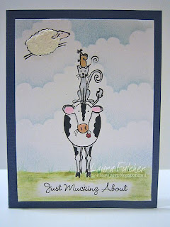
For today's card, I am posting a scene I created using one of the newer My Favorite Things clear stamp sets. It is called "Punny Farm." How great is that?! Most of the samples I have seen with the "mucking about" saying involve the woman image walking around in her rubber boots. I understand that kind of "mucking," but to me, I think of "muck about" by this definition- "to do random, unplanned work or activities, or to spend time idly." (Thanks wordwebonline.com for the definition.) This is what mucking about on a farm looks like to me.

To make the card, I stacked the animals on top of each other using an Adirondack black pad. Because the stamps are clear, they were easy to stack. I colored the animals with copic markers and colored the sky with the Rosie's Road Show cloud template and sponged blue ink. The sheep has texture in that he was coated with white liquid appliqué and heated until his wool puffed up. I stamped the saying with black ink and then watercolored around the text to finish the card.

Every once in a while, you just need to make a card that makes you smile.

Sunday, April 6, 2008

Faux Cracked Glass


This weekend I once again participated in Splitcoaststamper's Virtual Stamp Night. I tell you, it was exhausting! There were 18 challenges, and for some reason, I felt the need to participate in all 18. What was I thinking? I make it sound like an ordeal, but really, what is better than some time spent with friends hanging out and crafting?

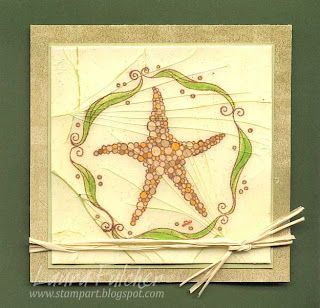
Today's card was my attempt at the cracked glass technique. I am including a link to a site with more detailed directions than I am providing. For the above card, I stamped the starfish (Impression Obsession) with Adirondack brown ink. colored it with Copic markers, covered the whole piece with Versamark ink, and embossed it with clear ultra thick powder. I reinked the paper with Versamark and embossed it a second and then a third time. When the piece was cool, I twisted it to create cracks in the faux glass. To make the cracks stand out, I rubbed the entire piece with Versafine Spanish Moss and then buffed off the extra ink. It is hard to tell from the picture, but the brown layer is popped up with pop dots. To finish the card, I tied some raffia around the bottom.

I am afraid this card doesn't translate well as a photograph. It looks rather flat to me and appears as though I simply drew some green lines across the starfish. In person, the layers of Ultra Thick powder look and feel like a broken tile.

I know I will be posting more Virtual Stamp Night cards soon. After all, I do have quite a few of them!

Thursday, April 3, 2008

How Distressing!

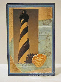
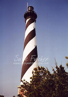
Okay, I admit that was a rather dramatic title for this post. However, I wanted to show a card that features Distress Ink. The first picture is actually the end product. It shows what the picture looked like after I changed it to a black and white photo, cropped it, colored it with Distress Inks, and scratched it with sand paper. This is what the original photo looked like:


The picture of the Cape Hatteras Lighthouse was taken by my mom during one of her numerous trips to North Carolina's Outer Banks. To say that she is a lighthouse junkie is a major understatement.

I would like to retract my earlier statement about how I changed the photo from color to black and white. In reality, I called my brother. The conversation went more like this, "Hey. Do you know that picture mom has hanging in her bathroom? Could you go and take it out of the frame, scan it, and email me a both a color and black and white copy? Great." I am so pathetic. I really don't know why he answers the phone when I call.

I then resized the photo with my paper trimmer and placed it onto a scrap piece of paper located on top of an old mouse pad. I wanted to brayer the card, and I think you get better results if you work on a soft surface (mouse pad) rather than a hard table. I spritzed the photo lightly so that the ink would spread well and brayered over the photo with Vintage Photo Distress ink. I rolled the brayer back and forth until I got the color I wanted. I let the piece dry and then scratched it with some heavy duty sandpaper to make the photo look old and worn.

For the other pieces of the card, I used more Distress Ink so that all the elements would match each other. The tan cardstock had ridges in it, so I picked up some ink with my finger and lightly brushed the same ink over the ridges to make them darker. That's right. I have 10,000 stamping tools, and I used my finger. Sigh.

I chose some scrapbook paper with shells on it, crumpled it, and ran an Antique Linen Distress Ink pad over the ridges to color them. I then spritzed the paper with water so that the ink would bleed and distress the paper. Once the paper was dry, I assembled all the pieces of the card. If the shell I chose hadn't had brown in it, I would have used Distress Ink on it as well.

I have to say thanks to my family for doing most of the work for this card!