Greetings friends. Today the IO team is sharing some of their favorite items from the April release. If you would like to see a full list of participating designers, you can find it on the Impression Obsession blog.

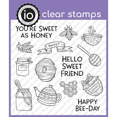
I absolutely love the bee stamps and dies from the latest release. I wanted to share a card today that uses two older items that pair very well with the bees. The first is the Honeycomb Cover a Card background. The second is the Inside Out Arch that serves as a very nice beehive.
To make the card, I cut out my arch and then placed my honeycomb background behind it. The background was cream cardstock with the honeycomb stamped on top with Versamark ink. I then sponged ochre colored chalk on top to make the honeycomb pattern pop.
For the top piece of the card, I stamped my flowers and leaves in various colors of ink and added my die cut bee images to the top. Each of the bee images were colored with Copic markers.
Thanks so much for stopping by. Did you have a favorite from the April release?
Impression Obsession Items Used: