Tuesday, September 30, 2008

Fall Trio

I think everyone has their crafting downfalls. For me, it is pumpkins. If there is a new pumpkin stamp, I pretty much want it. I can't explain why I need quite so many pumpkins. I just do.

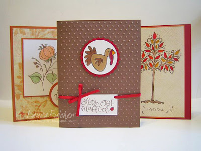
Today I am posting 3 of the 10 cards in my "10 in 10 fall class." Students will be pleased to know that I restrained myself to only two pumpkin cards in the lot. Believe me, I have enough images for a "10 in 10 pumpkin" class. Yikes!

I know you can't really see all the cards perfectly, but I will describe them anyway. The pumpkin card on the left uses a pumpkin flourish and "give thanks" saying from Impression Obsession. I colored the pumpkin in with colored pencils and layered it onto paper by My Mind's Eye.

The central card embraces my love of animal stamps and matching puns. Forgive me for any crudeness on my part. My last class decided that the turkey wasn't harmed in any way. He was simply invited to dinner and we were both going to eat a lot. Such softies! The turkey and saying are from Cornish Heritage Farms. The image was colored with Copic markers and layered onto a background I ran through my Cuttlebug machine.

Finally, the card on the right uses a tree from Impression Obsession and a saying by Savvy Stamps. I colored the tree with Tombo markers and the trunk with a watercolor pencil and blender pen. I don't know if you can tell from the picture, but there is a soft mesh background stamped behind the tree. It is by Cornish Heritage Farms and was stamped in a light brown ink.

If you are interested in the "10 in 10 fall" class, I am teaching it again on the 15th. I also scheduled two "10 in 10 holiday classes." The samples aren't finished yet, but they should be up sometime next week.

Happy fall y'all!

Sunday, September 28, 2008

Happy Birthday Mahnaaz

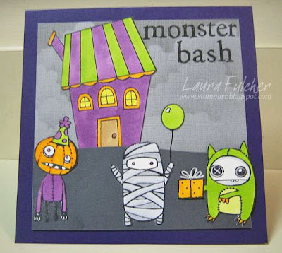
I wanted to wish my friend Mahnaaz a very happy birthday today. Plus, I wanted the chance to post the birthday card I made for her (don't worry, she has already seen it). Mahnaaz has a quirky sense of humor, and I knew traditional birthday images wouldn't work. So, I chose the Doodle Factory characters from Starving Artistamps that I knew she liked and made them into a birthday card. Plus, if you follow my blog, you know that this card appeals to my love of making party scenes with all my character stamps.

To make this card, I took grey cardstock and added some grey clouds with a cloud template, a sponge, and some grey VersaFine ink. I stamped the characters onto some white cardstock and colored them in with Copic markers. For the pumpkin guy and the green monster, I didn't worry about doing any shading. For the mummy, I decided to use several shades of grey so that
he would look more like a mummy and less like a rolly polly. I then cut out all the figures and added them to the dark grey cardstock foreground. The house (My Favorite Things) was made using the same process. I finished the card by adding a party hat (Cornish Heritage Farms), a balloon (company unkown), a gift (Stampendous), and added a saying (MSE) to the top.

Hope you have a great day Mahnaaz!

Wednesday, September 24, 2008

Poinsettia

I am still trying to come up with a Christmas card idea for this year. Right now, I have nothing. But, I do have some samples! I wanted to post this card as a contrast to my last post. For the last post, I tried to make something soft and pastel. For this card, I went for something bright and bold.

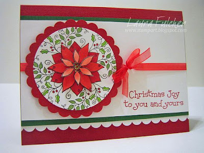
To make this card, I stamped the poinsettia stamp (Impression Obsession) several times onto white cardstock using black Memento ink. I punched out one of the poinsettias with a circle punch and saved it as a base. I then colored in all my poinsettias with Copic markers and cut out petals to pop up onto the circular poinsettia base. By doing this, I ended up with a 3-D poinsettia. I layered my circle onto a red scallop circle and added some Doodlebug scallop paper and a ribbon to finish the card.

For those of you who are Copic junkies and want to know about the coloring, you might notice that the center petals are lighter than the bottom petals. I only used one color of red, but for the center petals, I wanted a lighter shade of color. In order to do this, I used my colorless blender to pick up color from my red marker. I then colored the center petals with the toned down version of my red marker.

Sunday, September 21, 2008

Shabby Chic and Guest Artist

Last week's challenge on the Hero Arts blog was to create something "Shabby Chic." My understanding of Shabby Chic is that it is a worn, vintage look with a lot of pastels, distressed edges, fabrics, twine, buttons, pearls, etc... Basically, not what I normally do. But, I thought it would be fun to give it a try.

To make the card, I used three stamps from the same HA clear set and paper by Cosmo Cricket. I stamped the tree onto some light patterned paper with brown VersaFine ink and colored it in with various watercolor pencils and a blender pen. I cut out the tree and added some pearls to the bottom and to the center of the star. I stamped the bird onto my background paper and again onto the same light patterned paper as I used on the tree. I cut out the body of the bird and the wings from the light patterned paper and then glued it over the bird I had stamped on the background paper. I did this so that I wouldn't have to cut around the bird legs or the string with ornament. I ran some cream paper through a corrugator to give it thexture then ran some brown ink over the top to distress it. I also distressed all of the paper edges with some scissors and added some brown ink to the edges with a sponge. To finish the card, I added some buttons with waxed linen tied in the centers and some lace behind the corrugated paper.

For the next card, I want to share something my friend Marilynn made:

I wanted to share this card because it uses the same stamp I used in my last IO challenge but in a different way. To make her card, she stamped the image with Memento ink and then colored it with Copic markers. I really like the fact that she colored the trunk grey instead of brown...very spooky. I also like that she used both brads and an orange ribbon as embelishments. Marilynn said that the finished card didn't take much time to finish....always a plus!

Thursday, September 18, 2008

IO Design Team Challenge

Yeah! It is time for another design team challenge. I have really come to look forward to the challenges. I can't wait to see what everyone did to create a "Fall" themed card.

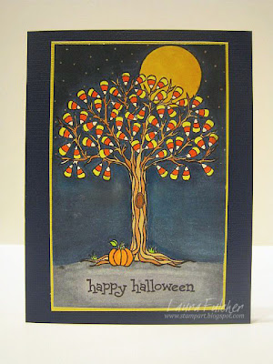
For my card, I had to play with the Leigh Hannan candy corn tree since I have been itching for a chance to use it. I colored the the image with various Copic markers and then colored around the tree with the Night Sky Copic marker. I didn't want to do a solid layer of blue around the tree mainly because that would use up a lot of my marker. Instead, I lightly colored around the tree and then sponged black and blue inks on top to fill in the color. I sponged black Memento ink at the top of the card, and that seemed to work well with the marker. I sponged a blue dye-based ink at the bottom of the sky, and it seemed to almost bleach the color a little bit. I liked the look, but I made a mental note of how the two mediums interacted with each other.

If you would like to check out the other design team fall cards, Julie, Daniela, Kelli, Penny, and Dina will all be posting samples some time on Thursday.

**post script...After having computer problems, Deborah now has her card posted too. Plus, she has a chance for you to win some IO blog candy. Woo hoo!

Monday, September 15, 2008

Christmas Ornaments

"It's beginning to look a lot like Christmas..." Okay, not really. It is in the 80's today and sunny. But, it is starting to dawn on me that I need to get a move-on with my Christmas cards. How did it get to be the middle of September already? Yikes!

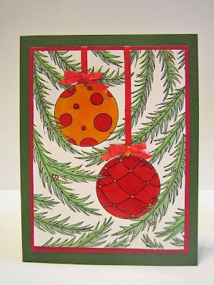
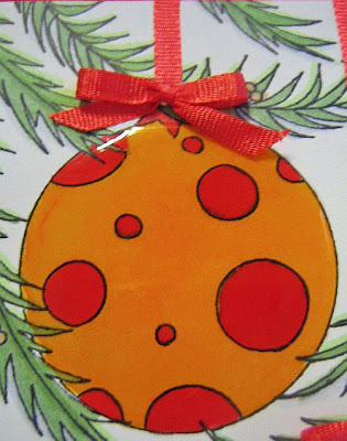
For today's card, I used one of my latest Impression Obsession images. Yes, the card is made using only one stamp! I colored the image using a couple shades of green Copic markers as well as my R17 (Lipstick Orange) and Y17 (Golden Yellow) markers. I don't usually post the particular colors I use because I don't want people to think they have to get the same exact colors that I have. I mean, who doesn't already have a red and yellow marker in their supply arsenal? However, I posted the red and yellow colors I used to point out that if you are using Copic markers and you want to pick colors that will work well with each other across color families, picking shades that have similar numbers is quite effective. For this card, I had markers with the same exact number (17), but they don't have to be that precise. It is just a good rule of thumb to help you pick out colors to go together.

The red ornament looks as if I used two shades of red. However, it is the same red marker. I just added a second layer of color in places to look as if there was more than one color used.

Here is a close up of one of the ornaments to show you that I coated the balls with Diamond Glaze to make them look like glass. I also added my own ribbons and bows to finish the card. I kept trying to add a saying to the front of the card, but I could never make it look quite right. Never mind. There was plenty of room on the inside!

**Special announcement. The IO guest designers have been chosen, and the first designer will be Dina Kowal. Congratulations Dina! Her coloring skills are simply amazing. Here is a statement from IO:
We had no idea when we posted the call for the Impression Obsession Guest Designer position that we would be flooded with talent from literally all over the world! We recieved 85 applications from amazing stampers making the choice very difficult! We wish we could have chosen all 85.

After getting the entire Design Team involved and into the mix of judging, one name floated to the top time and time again. That's why we are happy to announce Dina Kowal is our very first Impression Obsession Guest Designer!

Thursday, September 11, 2008

Dancing Chicken

I am posting today's card mainly because I want to ask for help identifying the dancing chicken in the center. I bought a set of unmounted dancing chickens (yes, I needed a whole set) at a stamp convention around '96. At that time, I didn't realize the value of keeping track of stamp companies. Now I would like to know who makes the set. Any ideas? The other chickens look like this one except they are in different dance positions.

To make this card, I stamped a whimsical stage by Rubbermoon onto cream cardstock and colored it with colored pencils. I then cut it out and glued it onto some silver metallic paper. It is hard to tell from the picture, but I used an exacto knife to cut out the center of the stage. The chicken is actually on the inside of the card.

Hope someone knows the stamp credits. It is driving me nuts!

Tuesday, September 9, 2008

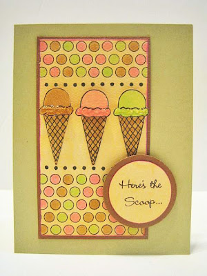
Here's the scoop

I am posting my card tonight and all I can hear in my head is Homer Simpson. "Mmmm...ice cream." Sometimes I think half of the things I do are accompanied by a tv or film quote in my head. Pretty sad.

Anyway, for today's card, I am posting one I made using the aptly named "Here's the Scoop" set from My Favorite Things. The background dots are from another one of their sets, but the name escapes me at the moment. I could go find the set, but I am currently suffering from the "lazies." I colored the ice cream cones and dots with Copic markers and added some Stickles to each cone for a little pizazz. The coloring was pretty straight foward. I didn't bother doing any highlighting or shading. Overall, it was a pretty quick card to make!

Sunday, September 7, 2008

Boo!

Sorry for the long break between posts, last week was crazy! I housesat/dogsat for the week and then watched as everything around me broke. That last statement seems like such a dramatic exaggeration,
but the sad thing is it wasn't far from the truth. The good news is I am back in my own bed, can use my own computer and have access to my newly repaired car. Life is good.

It was so good to see many of you at Angela's on Saturday to celebrate her birthday. I couldn't believe how many people braved the hurricane remnants to come to the store. I heard that Reston, VA received 8.8" of rain that day. Yikes!

For today's card, I am posting one I did with my new Hero Arts Halloween set. I have been doing so much lately with that set and the Basic Grey Ambrosia line. I am in love with that paper! I don't think the line was meant as a Halloween paper since BG describes it as "citrus injected with a zesty finish," however, I have found it to be perfect for the Halloween cards I have been making.

To make this card, I stamped the pumpkin with Memories black ink and colored it with copic markers. I then added "Boo" with a Hero Arts alphabet set and edged the cream paper with a sponge and black ink. It was a VERY quick card to make, and after the week I had, that is a VERY wonderful thing.