Tuesday, January 29, 2008

Fun with Clear Stamps


I really love working with clear stamps. I know I say it over and over, but I really have no crafting space at home. Clear stamps can really be a life saver because they take up little or no room. I store mine in a photo box. The box works well because it keeps my stamps out of the light (which will yellow them) , I can use the divider sheets for organization, and I can store my stamps on a bookcase for easy access.

Today's card is from my class on Wednesday and uses some of the new Hero Arts clear stamps. I love using clear stamps on patterned paper because you can place the stamp so that it doesn't obscure any interesting elements on the paper. For this card, I stamped the bunch of flowers three times with brown ink onto some of my new Crate paper. I loved using the clear stamps because I could stamp them over and over with easy placement on the paper. Any time I don't have to break out a stamp positioner makes me happy! I stamped the saying onto the reverse side of the paper, cut it out, and attached it to the front of the card. I added a few dots of a Stardust pen to the center of each flower for a little pizazz (although, it is hard to see from my scan).

Thursday, January 24, 2008

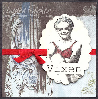
Vixen


Today I am posting another card from the Virtual Stamp Night I participated in last weekend. The challenge was "panties." There was a template provided for anyone who wanted to make a card that looked like a bottom covered with some underwear. Some of the tags people used were "100% behind you" or "running a little behind." A few of the participants (including myself) went the bra route. After all, how could I turn down using this stamp from Endless Creations? It makes me smile every time I see it. The best part was how quick and easy the card turned out to be. I think I finished it in about 15 of the 45 minutes provided. Trust me, any extra time is a beautiful thing during a stamping marathon!

To make the card, I stamped the "Vixen" onto white cardstock using Versafine black ink. The Versafine ink was necessary to pick up the tiny details of the stamp. I highlighted the bra with a red watercolor pencil and added a tiny amount of blue watercolor pencil to the woman's hair. I then punched out the image with a scallop punch and layered it onto some Basic Grey paper. As a finishing touch, I added a red ribbon for a little "ooh la la."

Tuesday, January 22, 2008

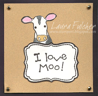
Love Moo


Valentine's Day has been in my head a lot lately. I have been a Valentine's Day card making machine! The card I am posting today is from my 10 in 10 Valentine's Day class this Thursday. I knew the second I saw the cow image from My Favorite Things that I had to have it! So cute! I stamped the cow image onto white cardstock and colored it with watercolor pencils and a blending pen. The original image has a cow inside a square frame. I cut out just the cow and glued him behind a frame by SassafrasLass. The "I love moo" saying is by Penny Black. To finish the card, I added some gold brads and layered it onto black cardstock. Very easy! Just a quick post today, but I thought I might post more often if I remembered it is okay to just post a card and give instructions on how to make it. I don't always have to print my life story!

Monday, January 21, 2008

What a weekend!

Last Friday and Saturday, I participated in my first Virtual Stamp Night (VSN) through Splitcoast Stampers. Whew! It was exhausting! For a VSN, there is challenge posted every hour (6 on Friday, 12 on Saturday), and you have 45 minutes to complete each challenge. You can participate in as many or as few as you want. You even have the option to complete a challenge at a different time during the weekend. My guess is that not everyone wants to stamp for 12 hours straight! The only rule is that you restrict yourself to the 45 minute deadline when you do start a challenge. Participants are then encouraged to post their results in specific galleries so that others can see the finished projects.

The funny thing about a 45 minute deadline is that sometimes 45 minutes would fly by and other times it passed so slowly. The good thing about a time limit was that it forced you to make a decision and "go with it." There was no time to second guess yourself. As a result, some of my finished projects I like, and some were not so great.

For today's card, I am posting the results of the polished stone challenge. All stamps used in this sample were made by Impression Obsession. For my card, I took white glossy paper and dotted it with a few spots of gold Krylon ink. I then dabbed the card with felt coated with a few shades of alcohol ink. The alcohol inks interacted with the gold pen so that the gold formed a webbed design on the card. To finish, I added a few drops of Blending Solution to the center of the card. The Blending Solution actually spread the alcohol ink out towards the edge of the card so that I was left a space to stamp a focal image. My advice when working with alcohol inks is to work fast. If you let the Krylon dry at all, you will be left with gold dots on your paper. The gold ink will only feather if it is wet when you dab it with the alcohol inks.

Finally,

My advice for the challenges (coming from a challenge newbie):
  1. Stock the fridge with drinks and finger foods. I think my friend Chrisi and I didn't plan meals very well. We should have had a fridge packed with fruit, cheese, sandwich makings, etc. We were actually pathetic enough to call her sister at one point and ask her to bring us food (which she did).
  2. Get together with some friends and have a sleep over. I think my favorite part of the weekend was Friday night with my friends Jennifer, Tami, and Chrisi. Four was a great crafting number. It was enough people to make it feel like an event without getting in each other's way.
  3. Figure out how to post to a gallery BEFORE the actual event. This seems like obvious advice, but I had to learn it the hard way.
  4. Go with the flow on challenges. As a mentioned before, you have to make some quick decisions and as a result, not everything will turn out fabulous. I think I was a happier person expecting a few duds in the bunch.

Monday, January 14, 2008

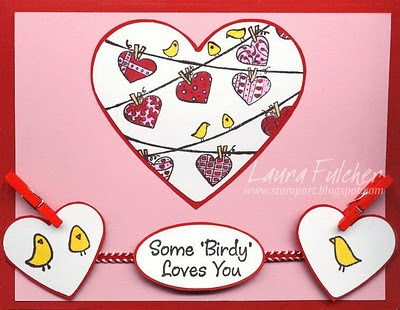
Some Birdy


Before Christmas, I received all kinds of wonderful goodies from Impression Obsession featuring their new line of images. Unfortunately, I hadn't gotten around to making any samples until today. I am so excited that I have some new samples to share on my blog using brand new materials!

For today's card, I used the new Heartlines collection of stamps. What a fun group of images! I noticed that a couple of the other design team members have made samples with these stamps, so I guess they are rather popular.

To make the "Some Birdy" card, I stamped the heartlines image and small birds onto white cardstock using black Adirondack ink. I punched the heartlines out with a large heart punch and used a smaller heart punch for the little birds. All of the images were then colored with various shades of Copic markers. I specifically chose to use an Adirondack ink pad as it works well with the alcohol-based Copic markers. I tried to outline my white hearts with red markers so that they would stand out against the pink cardstock. Every pen I used bled, so I chose to glue the hearts to red paper and cut out a border. To finish the card, I added a corded ribbon and some red clothespins. It is hard to tell from the scan, but I popped up the two little hearts and oval saying using some foam tape.

Wednesday, January 9, 2008

Choosing Colors


I sometimes get in a rut and choose the same colors over and over for my cards. Trust me, I have made a TON of key lime and bright blue cards! To shake things up, I sometimes pick out scrapbook papers in a different color scheme than I typically use. It helps me break out of my rut and it guides me in selecting new colors to pair together.

For today's card, I selected a Valentine from my upcoming 10 in 10 Valentine class. The paper is made by Cosmo Cricket and has a red fleur-de-lis pattern on one side and a distressed gray/green on the other. I thought the pairing of colors was quite interesting. I stamped a heart by Impression Obsession onto the green side using Brilliance Rocket Red ink and embellished the dots of the heart with a white Sailor pen to match the white of the card. I then layered all of the pieces onto a coordinating Bazzill card. Very simple and not key lime and bright blue!

Tuesday, January 8, 2008

Happy Birthday Elvis (and me)

Elvis and I share a common birthday, so I thought it would be appropriate to post a card dedicated to the king. For today's card, I stamped Elvis (Stampsmith) four times onto white cardstock using 4 colors of Versafine ink. If you don't own any Versafine ink pads, I highly recommend you get one to try...you won't regret it! Versafine pads don't come in a lot of colors, but they are great because they are formulated to pick up tiny little details in stamps. The Versafine ink was a perfect choice for this stamp since it has a lot of finely etched lines that make it look like a photograph. Regular stamp pads leave the Elvis image looking blurry, and you can't make out the details of his face. On another note, I have found that the Versafine pads are also fantastic to use with clear stamps. The ink works well with the clear images and is so easy to clean off your stamp when you are done. I finished the card with a saying from Viva Las Vegas Stamps. It may not come as a surprise, but Viva Las Vegas has a lot of Elvis images and sayings. Imagine that!

If you click on the card to make it bigger, you might notice some fine vertical lines on the card. They were due to my old scanner and not the image itself. I didn't want to blame the Stampsmith image! I hope you enjoyed the Elvis tribute...maybe next year I will do a David Bowie tribute. :)

Wednesday, January 2, 2008

Mother-Daughter Challenge

In October, my mom and I attended a stamp show in Hampton and had so much fun at the make-and-take/dessert party. While we were there, we were inspired by a pocket card that we made. We could of have just made our cards and been happy, but that isn't us. We instantly challenged each other to make our own versions of the card.

To make the card, take a 10 1/2" x 4 1/4" piece of paper and turn it so that the longer part of the card is horizontal. Score the card 5 1/2" from the left side. (The 5 1/2" section will become the back of the card.) Score the card again 1" from the right side of the card. That will leave you with 4" for the front pocket of the card and a 1" flap for the top of the pocket.

Staple the card on the flap so that the card forms a pocket and so that the flap is securely held down. Cut a second piece of cardstock to measure 3 3/4" x 4 3/4" This will be the inside piece of your card that will fit inside the pocket.

My card is the "Moments" card made from Impression Obsession images. I chose a two-sided paper by My Minds Eye so that the font and back of the card would coordinate. I stamped the flourish three times so that it formed a line along the left side of my card. I stamped the word "moments" and added some blue rhinestones to finish the card.

My mom made the "let it snow" card with the snowflakes. (I am not sure who made the saying). She used blue cardstock to make the card and then layered snow paper onto the front of the card. To finish the card, she added punched out snowflakes, a white bow, and a wonderful Christmas tree stick pin.

Overall, it was a fun challenge. It is always fun to see how two people take the same card sketch and come up with two completely different projects.