Sunday, September 30, 2007

Love the Pears

I posted a pear card a couple of days ago, and it prompted me to post another one. I don't know what it is about pears, but I sure do love to stamp them!
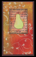
One of the great things about working with pear stamps is that you can really play around with the colors. It is okay to stamp them in greens, golds, burgundys, etc... For my card today, the pear turned out kind of pink!
For today's card, I stamped a pear word background (A Stamp in the Hand) onto cream cardstock and embossed it in gold.
To create the pear, I colored the stamp (again, A Stamp in the Hand) with watercolor crayons, spritzed it and stamped it onto white cardstock. The beauty of watercolor crayons and a solid stamp is that you never know the result you are going to get. This card's pear looks kind of "splotchy." Sometimes the watercolor looks smoother.
I stamped a striped background (Hampton Art) with the same process- watercolor crayons colored directly onto the stamp, spritzed and stamped onto white cardstock. I wanted the lines to be somewhat well-defined, so I didn't use as much water as I did with the pear.
I then layered all of the pieces and included a piece of white mulberry paper that I had spritzed with a gold glimmer mist. You can't tell from the picture, but the mulberry has a "shimmer" to it.
Oh! One last tip when working with watercolor crayons on a stamp- be sure that the stamp is SLIGHTLY wet when you apply the crayon to the image. You will find it so much easier to color the stamp! I like to wipe the stamp with a damp paper towel...that way you don't get too much water onto the stamp.

Monday, September 24, 2007

Excited!

I don't normally blog this frequently, but I just checked out Dave Brethauer's blog and saw that he posted my jack o'lantern card from my upcoming 10 in 10 card class on his site! I am so excited that he liked it! I am sure the fact that it uses one of his new stamp sets has nothing to do with it. :)
I have two upcoming classes this week, so there is much to do. "Fall for Impression Obsession" is on Wednesday and uses their new line of fall images. The cards in the class are the same ones I created as an IO design team member. 10 in 10 Fall is Sunday and has 3 Halloween, 3 Thanksgiving and 4 quick generic fall cards. It never hurts to have a stash of cards on hand!
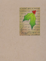
I was planning on posting my pumpkin card that appeared on Dave's blog but just realized that I haven't scanned it yet and my only copy is at Angela's. So....plan B. It seems odd that Dave has a picture of my card, and I don't! Instead, I am posting a card from the class I took last Saturday. The card was designed to have us practice our Prismacolor blending techniques. The holly leaves were made using three shades of green that were blended together. I worked hard to try and get the color grade to transition smoothly. I still need to practice!

Busy, busy weekend

I have to say, I had a FABULOUS weekend! How did I know it was going to be a good weekend? It started out with me driving behind what I would call a "bubble car." It had painted bubbles all over it, and when it turned a corner, bubbles shot out of the back. It doesn't get better than that! I also knew it was going to be a great weekend because Dave Brethauer, owner of Memory Box, was teaching at the stamp store where I work. Guest artists always make for a busy weekend, but it was definitely worth it.
For those of you who know me, you know that I love to color with color pencils as well as paint with watercolors. Most of what I learned was from Dave's first book called Stamp in Color. That book is out of print, but his new book is out and called Card Design. It has wonderful samples in it and really helps you get a grasp on coloring images.
**On a side note to my family who read my blog, Dave is from Wray, CO and therefore knows about Akron and Otis. I think he is the first person I have EVER met who knew where our family is from (and that includes all the people I have met who were born and raised in Colorado). We even had a conversation about the Norka! It really is a small world. Okay, back to the crafting...
Although Dave taught both a color pencil and watercolor class, I took a combined class along with the other staff members at Angela's Happy Stamper. It was so incredibly generous of Angela to pay for us to have a private class. She is such a great boss!
The first card I am including is a card we made in the class using watercolor pencils and a paintbrush. We scribbled color here and there around the pear and then blended with a paintbrush and water. We worked from light to dark colors (can't take away any extra watercolor paint) and moved the brush from top to bottom using a "wiggle" motion. I know I am not giving the technique justice. I guess that is what his book is for!
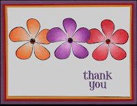
The second card is a card I made Dave as a thank you. It used some of techniques we learned using Prismacolor pencils. I don't use gamisol with my Prismacolors because I think it dulls the color and it sometimes eats my paper. I do however use a blending pencil to crush pencil colors together. In Dave's class, we didn't use either the gamisol or the blending pencil. Instead, we learned to work with just the Prismacolors themselves to achieve the final look. I really like the effect. I finished the card off with matching rhinestones, but it is hard to tell what the centers of the flowers are from my scan.
This blog entry ended up to be rather long. I guess you can tell that I had a wonderful weekend and had to ramble on about it for a bit. Sorry!

Thursday, September 20, 2007

The calls have begun

The good news is that I have received a lot of calls from friends lately. The bad news is that they were all calling me to update my blog. Where is the love? :) I told my mom that story and she said, "I guess it's good I didn't call you asking that." Apparently she had the same intentions.
I have been so busy getting some classes together that I haven't done much blogging. I have a couple of "10 in 10" classes coming up, so I will be sure to post some samples.
Today's card is one of the cards from my "10 in 10 fall." The tree elements are from a clear set made by Memory Box and the saying is by Impression Obsession. What makes this a quick card is that there is no coloring involved. I often get so involved in planning how I am going to color objects that I forget that you can simply "ink and stamp." Sometimes it is best to stick to the basics!
I chose to post this card because Dave Brethauer of Memory Box will be at Angela's this weekend!!!! I can't begin to explain how excited I am. I love his coloring techniques and can't wait to learn from the master. I promise to post a report on his classes.

Wednesday, September 5, 2007

Creative Carving

I feel like a bad blogger, but I had Labor Day weekend to enjoy and car problems to deal with first. My mom says that I have "bad car karma." I am beginning to agree with her. I swear it felt like my car was possessed yesterday. The door lock mechanism went crazy, and I had to listen to "click, click, click, click, click...." as the doors continually tried to lock and unlock themselves. I heard clicking as I drove, and I heard clicking even when I turned off the car! Has anyone ever heard of such a thing? Anyway, I had time tonight (after my enjoyable ride home sans clicking) to work with a stamp that I carved myself
Carving stamps is a weird thing for me. On the one hand, I LOVE having something that I made myself. On the other hand, I find the process of actually making the stamp tedious and stressful. My friend Michael claims that carving is very relaxing, but she is clearly insane.
To carve my own stamps, I buy the pink carving blocks at Michaels (carving materials are located in the art section next to the calligraphy supplies). There is a white block available that is cheaper, but I find that the white blocks crumble too much. If you do a lot of detailed carvings, you might want to get higher end carving blocks that allow for better shallow cuts, but for me, the stuff at Michaels works fine.
For my image, I either draw or modify clip art onto a piece of paper. Technically, you don't have to alter clip art to use it (no copyright), but I find most clip art needs to be simplified so that it won't be as hard to carve. I trace the image with a pencil and then place the image on top of the carving block (lead side down). I rub over the back of the paper so that the lead is transfered to the carving block. **Remember to reverse your image if you are carving letters** I then begin the process of carving around my lines. Some people like to leave a lot of stray carving marks in their piece so that it has that "carved" look. I tend to work hard to remove those lines.
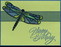
For my dragonfly card, I embossed my image with clear EP and then colored it with Twinkling H2O's. If you click on the dragonfly picture, it will enlarge so that you can actually see the shimmer of the watercolor paints. It was a lot of work, but I love saying I made the dragonfly myself!
Ps...the saying is by Hero Arts. I'm crazy, but not crazy enough to carve that.