Friday, October 7, 2016

IO/MISTI Blog Hop


Greetings friends.  Today I am very happy to participating in a blog hop between My Sweet Petunia (makers of the MISTI stamp positioner) and Impression Obsession.  The two design teams have created projects that show the advantages of using a very precise stamp positioner with your rubber or clear stamps.

Be sure to visit each of the blogs participating in the hop and leave comments on each blog as you go so that you will be entered to win a prize.   On Wednesday, October 12th,  two winners will be drawn from everyone who leaves a comment on ALL the blogs in the hop to win a prize.  One person will win a mini MISTI and another will win a $25 IO gift certificate. Winners will be posted on the My Sweet Petunia and Impression Obsession blogs as well as their Facebook pages.  Good Luck!


For the hop today, I made two different cards that highlight the precision of the MISTI stamp positioner by My Sweet Petunia.  MISTI stands for the Most Incredible Stamp Tool Invented, and I have to say, it is absolutely amazing.  I have started using it in my classes, and I have yet to meet anyone who didn't love it.

The first topic I wanted to talk about was stamping on uneven surfaces.  I do a LOT of watercoloring, so I am constantly stamping images onto watercolor paper.  If you have ever stamped on watercolor paper, you have probably noticed that the bumps of the paper often prevent you from getting a nice, sharply stamped image.  Therefore, I have started using the MISTI with all of my watercolor projects so that I can stamp an image over and over on top of itself until I get an image that doesn't have missing lines.


Here is a picture of the Curious Squirrel by Impression Obsession before I did any watercoloring:


Even though this image is highly detailed, you can not tell at all that I overstamped the squirrel more than once.  The MISTI really lets you stamp an image precisely on top of itself.  Can you tell his cute little whiskers were stamped twice?  I also stamped the saying from the Card Sentiments set using the MISTI because I knew I would have to stamp it more than once on the watercolor paper.

Of course, I couldn't resist stamping my own background with two Impression Obsession Cover a Card backgrounds.  The "patterned paper" I stamped is a combination of the Distressed Denim CAC stamped first with Color Box Ice Blue Chalk ink to give a mottled look.  I then stamped it with the new Boxwood CAC with Color Box Azurite Chalk ink. 


The second card I made also illustrates the advantage of having a very precise stamp positioning tool.


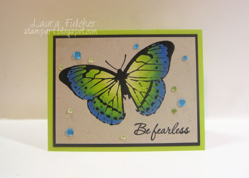
The first step was to stamp the Watercolor Butterfly onto kraft cardstock:


You can see that with my first stamping, the body of the butterfly didn't show up very well.   This often happens with solid areas on stamps. Normally I would stamp it again with the MISTI, but for the bottom layer, my butterfly didn't need to be perfect.

For the next step, I colored the butterfly with an assortment of blue, green, and yellow Prismacolor pencils.  The best part of this technique is that you can color on top of all the lines of the butterfly wings.  Not having to stay in the lines makes coloring really fast!   When I finished coloring, you could still see the lines, but they were blurry and clouded.


I definitely had to overstamp the butterfly again using the MISTI to put the lines back on the image.  I wanted to add a glossy look, so I stamped the butterfly again with black pigment ink and embossed it with black powder to give the wings some shine.


Once again, the lines of the butterfly matched up perfectly.  On a side note...  I pressed really hard with the pencils to crush the color onto the paper.  When you press that hard with the pencils, I think it gives it a finished look that is similar to acrylic paints.

I didn't plan it, but I did mess up my sentiment when I added it to the card:


I took a picture so that you could see how I fixed it with the MISTI for the finished card.


I hope you visit the other designers in the hop to get lots of ideas and for the chance to win a prize!

Blog Hop:
Laura Fulcher (You are here)

Thursday, October 6, 2016

IO Challenge- Fall Birthdays

Making birthday cards that match the season is always a fun idea.  It is nice to coordinate colors or images that match a particular time of year.  For this challenge, the theme was Fall birthdays.

To make my card, I sponged some yellow, orange, and magenta PanPastels onto white cardstock.  Next, I stamped the Abstract Zinnia on top using black Versafine ink.   To accent parts of the flower, I added some streaks of yellow and white Prismacolor pencil.  To finish the card, I added one of the sayings from the Life Stuff Sentiments clear set. 

Need more Fall birthday inspiration?  Be sure to visit the other designers:


Wednesday, September 28, 2016

IO/Stencil Girl Blog Hop!


The Impression Obsession and StencilGirl Products Teams are hopping together this week!


StencilGirl Products will be giving away a $25 Gift Certificate to TWO lucky winners!

Impression Obsession will be giving away a $25 Gift Certificate to TWO lucky winners!

Visit the fabulous designers from both teams and comment for your chance to win 4 great prizes during the hop!

The more blogs you comment on, the more chances you have to WIN! (One comment per blog please.)

You have until Friday, September 30th at 11:59PM Central Time to leave your comments.
Winners will be announced on StencilGirl's Facebook page on Sunday, October 2nd.

Here are the links to today's hop list:


For my first card today, I combined the Stencil Girl Waterway Stencil with the Impression Obsession Butterfly 4.  To color the butterfly, I used an assortment of Prismacolor Colored Pencils.  For the stenciled background, I used the stencil, watercolor paper, and some Colorburst Powders.  Here is a close up of the background:


For my next card, I used a stencil called Seoul Day and a stamp from Impression Obsession called  She Was Unstoppable.  I have so many wonderful sayings from Impression Obsession, and stencils are really a great way to create a backdrop for them:


I was first attracted to this stencil because of its title.  For those of you who are close to me know,  I am (kind of ) obsessed with Korean dramas.  I have to admit I perked up a bit when I saw the stencil.  You can use it as I did as an abstract background or you can color it to really bring out the shapes of the hanging flags.  To make the card, I placed the stencil down onto white cardstock, sponged it with Versamark ink and then sponged it with chartreuse, turquoise, and dark blue PanPastels.  Here is a close up of the background:


Ps...anyone out there watch Korean dramas?  My family and friends just don't understand what the heck I am doing.  :)

For my finial card, I combined a stencil called Whimsical Waves as well as an Impression Obsession saying called Soul Happy:


Once again I combined Color Burst powders and the stencil to create my watercolor background:


Thursday, September 15, 2016

IO Challenge- Trick or Treat


I absolutely love making Halloween cards, so this challenge was up my alley.  I really like all the new creature stamps because they really lend themselves to coloring.  Of course, the fact that this monster's name is Sara Beth endears her to me even more! 

Here is a close up of the monster:


To color the monster, I used an assortment of Copic markers (YR31, V22, V25, YG95, YG63) as well as some Yellow Ochre PanPastel for coloring.  To finish the card, I added the Boo sentiment.(Boo To You).

Need more inspiration?  Be sure to visit the other designers:

Thursday, September 1, 2016

IO Challenge- Fall Colors


Greetings friends!  Is it feeling like Fall yet in your neck of the woods?  I have to say, I always look forward to Autumn with the cooler weather and beautiful colors.

For today's card, I decided to express my Fall colors with some browns, yellows, and oranges.  I made sure to color the eyes of the owl with some yellow and orange markers so that it would match with the layering papers.

To make the card, I stamped the Owl in Tree in brown Versafine ink onto 140lb watercolor paper.  I then colored his body with some grey and his eyes with some yellow and orange Zig Clean Color brush markers.  To add a bit of color to the tree, I sponged it with some Burnt Sienna PanPastel chalk.
For the background, I stamped the Cover a Card Wood Grain onto kraft cardstock with Colorbox Chalk Deep Brown ink and embossed it with clear powder for a bit of shine.  Here is a closeup of the owl:


I usually stamp a sentiment on the outside of the card for blog samples, but I thought it got in the way of my little owl.  this is what I stamped on the inside of the card:


The name of that stamp is Owl Be Thankful

Need more Fall color inspiration?  Be sure to visit the other designers:

Wednesday, August 31, 2016

CardMaker Blog Hop


Welcome to the CardMaker/Impression Obsession Blog Hop. There are so many great ideas by the two design teams to share with you today.  Be sure to visit both the CardMaker blog and Impression Obsession blog for full details of the hop as well as a complete hop list..

.
Impression Obsession will be also be hosting a giveaway of a $25 gift certificate to their shop.
All the details about the prize can be found on the Impression Obsession blog.  Good luck!


Greetings everyone!  My name is Laura Fulcher and you should be joining me from Kelly Gettelfinger's blog. 

For my card today, I wanted to share a background I created with Impression Obsession Cover a Card stamps as well as one of their new Christmas images.  

First, I started with the Metal Cover a Card background and stamped it onto a blue notecard with Colorbox Chalk Azurite ink:


Next, I stamped on top of that background with the Snowflakes Cover a Card background using Versafine Magestic Blue ink:


I thought the two backgrounds combined looked a bit like snowflakes with fractals.

Next on the agenda was the car with tree on the roof (called To Grandmother's House)..  I colored the whole thing with Zig Clean Color Brush markers and a waterbrush.  Here is a bit more detail:

Instructions:
·         Stamp car onto 140lb watercolor paper with black archival ink.
·         Allow ink to dry
·         Color a line of brown under the car and blend with a waterbrush
·         Color the top and sides of the card windows lightly with blue marker and blend with waterbrush
·         Color the tree sections with a line of green and a line of light green marker.  Blend with waterbrush
·         Color the car with a line of red marker at the top (area under the windows)
·         Color a line of pink underneath the red and blend some with the pink marker
·         Blend side of the car with waterbrush
·         Color the tires grey (no blending)
·         Add accents with light grey marker

I finished the card by adding the Warm and Cheery sentiment.

I hope you enjoyed!  Don't forget to visit the next person on the hop list:


I

Thursday, August 18, 2016

IO Challenge- A Day at the Beach


Has everyone made it to the beach yet this Summer?  I grew up in a beach town, so I feel as though the ocean is always calling to me. 

For today's card, I colored images using watercolor pencils since it seemed an appropriate choice to pair with beach cards.  I used a crab stamp from the IO Summer release named Carlotta (B19150) and paired it with the Everything's Better- Beach sentiment (B19157). If the beach isn't your favoritie, there is also these sentiments in a similar style:
Everything's Better in the Sun (B19160)
Everything's Better at the Lake (B19156)
Everything's Better at the River (B19158)

Don't forget to visit the designers and to enter the IO card challenge!


Thursday, August 11, 2016

IO Blog Hop- Day 4

Welcome to the Impression Obsession Fall/Winter Release Blog Hop!
We have some beautiful new stamps to share and four Gift Certificates to give away! The Blog Hop will be posted on the Impression Obsession Blog at 6am EST each day Monday August 8th through Thursday August 11th. Visit our fabulous IO Design Team’s blogs (only one comment per blog per day please) for a chance to win one of FOUR $25 Impression Obsession Gift Certificates!
 
The more blogs you visit … the better chance you will have to win!!!
No need to comment on the Impression Obsession Blog to enter.
 
Comment entries for all of the hop days will be open until 9pm CT on Sunday 14th. ALL WINNERS will be announced Monday August 15th on the Impression Obsession Blog.

Welcome to the final day of the blog hop!  For today's card, I wanted to share a card for winter.  I apologize that I was unable to get a better shot of all the glitter I put under the snowman that looks like snow. 

For the background, I once again created a layered effect with my cover a card stamps.  I used the brand new Splattered stamp with Colorbox Chalk Ice Blue ink and then added the Cover a Card Snowflakes on top with Colorbox Calk Azurite ink.  The Splattered stamp is a really good one to use as a base color.  It adds a slight mottled look to your cardstock that pretty much works with anything you choose to layer on top of it.

For the central image, I used the new snowman named Sandy along with the Season's Greetings sentiment.  I colored the snowman with various Copic markers and then added some stickles to the wings for sparkle.  Under the snowman, I added liquid glue from Art Glitter as well as some loose glitter.  The liquid glue added dimension and texture that looked more like a snowbank.


 Today's Hop List:

Wednesday, August 10, 2016

Impression Obsession Blog Hop- Day 3


Welcome to the Impression Obsession Fall/Winter Release Blog Hop!
We have some beautiful new stamps to share and four Gift Certificates to give away! The Blog Hop will be posted on the Impression Obsession Blog at 6am EST each day Monday August 8th through Thursday August 11th. Visit our fabulous IO Design Team’s blogs (only one comment per blog per day please) for a chance to win one of FOUR $25 Impression Obsession Gift Certificates!
 
The more blogs you visit … the better chance you will have to win!!!
No need to comment on the Impression Obsession Blog to enter.
 
Comment entries for all of the hop days will be open until 9pm CT on Sunday 14th. ALL WINNERS will be announced Monday August 15th on the Impression Obsession Blog.


Greetings everyone.  As you know, I really like to make use of my cover a card backgrounds.  Therefore, for today's card, I wanted to share a background that I made using the same exact background stamps I used for yesterday's winter card.  Isn't it amazing how different the looks are just by changing the colors and the images you choose to pair with them?

Once again I used the new Splattered Cover a Card in dark purple pigment ink (Versafine Imperial Purple) and the new Scratched Cover a Card in a lighter pigment ink (Colorbox Chalk Violet).

To finish my card, I added the Ghoulish Greetings sentiment (C19252) and the "Our Gang" image (D19227) and colored both with Copic markers.


 Today's Hop List:


Tuesday, August 9, 2016

Impression Obsession Blog Hop Day 2


Welcome to the Impression Obsession Fall/Winter Release Blog Hop!
We have some beautiful new stamps to share and four Gift Certificates to give away! The Blog Hop will be posted on the Impression Obsession Blog at 6am EST each day Monday August 8th through Thursday August 11th. Visit our fabulous IO Design Team’s blogs (only one comment per blog per day please) for a chance to win one of FOUR $25 Impression Obsession Gift Certificates!
 
The more blogs you visit … the better chance you will have to win!!!
No need to comment on the Impression Obsession Blog to enter.
 
Comment entries for all of the hop days will be open until 9pm CT on Sunday 14th. ALL WINNERS will be announced Monday August 15th on the Impression Obsession Blog.


For today's card, I basically designed an entire card around the new "Can't Adult" saying because I love it so much.  Do you ever see a saying that just speaks to you?  Well, this one certainly did for me!  There are days I just don't feel like being an adult.

To make the card, I stamped a new image called Diane onto some XPressIt blending cardstock and colored her with some Copic markers.  I added just a little bit of a light blue Copic around the image to give her a little pop.

I was really happy that the latest release had some new Cover a Card backgrounds as well.  Whenever possible, I prefer to make my own "patterned paper" by stamping and layering my own designs.  For the background, I created a pattern using the new Splattered Cover a Card in grey pigment ink (Colorbox Chalk Grey Whale) and the new Scratched Cover a Card in blue pigment ink (Colorbox Chalk Azurite).

 Today's Hop List: