Wednesday, April 28, 2010

Looking like a Monkey

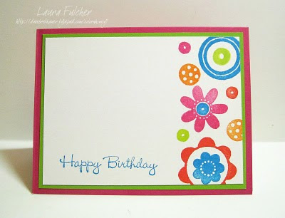
So, you might look at this card and think that I made a cute birthday card for a child. Umm...no. This card was for one of my adult friends. Apparently, I am the one who is childish. Actually, I am kind I sorry I didn't save the idea for my brother's birthday in June. It would have been perfect.

The monkey and leaves come from a Hero Arts clear set. I stamped them both with Vintage Sepia Versafine ink and colored the monkey with Prismacolor pencils. For the leaves, I smushed some Colorbox Chalk moss ink over the top and cut them out. When I added the ink direct-to-paper, some areas were lighter green and some were darker. I liked the effect, and it was really quick. Of course, then I had all those leaves to cut out, which wasn't quite so fast.

The saying is by DRS Designs, and I knew I had to have it when I saw it. Again, my maturity level sometimes runs kind of low.

Monday, April 26, 2010

Moxie Fab Sketch Challenge

I wasn't sure if I would have time tonight to play along with the latest Moxie Fab challenge or not. The good news is that my snowman paper from My Mind's Eye did most of the work for me. I just added a cute saying by Custer's Last stamp, some Bazzill white dot paper, snowflakes from a Carl punch, and some Memory Box metallic paper and pearls. You might be able to tell from the shadows that I popped the snowflakes up with a tiny bit of foam tape.

The challenge itself was to make a card following this sketch:

Now I just need to give the card to someone who won't be insulted. :) I have really enjoyed seeing the cards that people have created for this challenge. Fabulous!

Friday, April 23, 2010

Playing with Tim

Last month I travelled with Angela to Boston to attend a trade show designed for store owners and employees. While there, I took three classes with Tim Holtz. I was really excited about the classes because even though my style of stamping differs a lot from Tim's, I heard he is a wonderful instructor. Well, the rumors are true. He rocks as an instructor. I was very impressed with his slide shows and his ability to keep everyone on track and focused. Plus, it doesn't hurt that the man really, really knows his stuff!

As for the classes, my head was filled with ideas from all of them even though I don't know that I will make the specific projects again. In my Distress Ink class, I was able to play with all the new colors of Distress Ink and fell in love with each and every one of them. Just how many colors do I need?! Instead of making cards, we used the inks to color the grungeboard roses we made. I have to say, I am not sure that I am a "build your own flower" kind of gal. It sure is a lot of steps!

In the second class, I got a chance to make some jewelry with Tim's new Ideology elements. The jewelry pieces are cool, but not necessarily my style to wear. We made a metal rose from scratch (see my feelings on that above) which turned out pretty dang awesome. What I liked best about this class was Tim's thoughts on coloring metals. We did a faux patina on metal using some Adirondack paint daubers as well as colored metals with a mix of alcohol inks and metal mixatives. I can't wait to play around with these techniques more!

The picture above is from my third class. We made a house tryptich out of canvases using Claudine Helmuth's product line (Tim and Claudine both work with Ranger). It was interesting to see Tim's take on the products since he and Claudine are so different from each other. For the first house with the numbers, Tim showed us a transfer technique he learned from Claudine that allowed us to transfer his numbered paper onto sticky back canvas. I can't tell you enough how much I loved this. Attention friends and family, you might be getting paper transfer canvases for Christmas. :)

Monday, April 19, 2010

Clean and Simple Challenge 86

I played around with the latest Clean and Simple layout challenge by using circular elements from Impression Obsession's clear Mod Flowers set. When I first started stamping the images on the paper, they looked like a zig zag pattern to me. When I finished though, they looked more straight up and down. I guess my tendency for straight lines and angles prevailed!


Wednesday, April 14, 2010

Back to High School


Another Impression Obsession challenge today! This time the theme was high school colors. For me, that meant breaking out the old red, white, and blue. Go Cavaliers! Of course, I then went to college where I was..... a Cavalier. I have no imagination.


Although I was working with red, white, and blue, I decided I didn't want to make a patriotic card. Instead, I chose a nautical theme. I made the plaid background by stamping the Cover a Card thick and thin stripes (CC008) in two different directions using Blue Iris and Warm Red Colorbox Chalk ink. The stamps are all from a Leigh Hannan clear set called Sunshiny Day (CL184).

Want to see the other designers' walk down memory lane? Check out what Deborah, Dina, Jeanne, Jenny, and Kathy created.

Want to play along ? You can win a $25 IO gift certificate! All the information can be found here.

Friday, April 9, 2010

Clean and Simple 85

Well, it is late, and I can't sleep. Do you ever have one of those nights when your mind just won't shut off? I decided to get back up rather than stare at the wall and saw that Clean and Simple had a new layout. Here is the sketch:

I used one of my favorite stamp sets from Cornish Heritage Farms and airbrushed one side of the card. I then colored the fish with Copic markers and added a piece of paper that I ran through my Cuttlebug with a bubbles embossing folder. Pretty darn easy!

Thursday, April 8, 2010

How Distressing!

I have done a lot of work with Distress Inks lately (and have the inky fingers to prove it). I am working on cards for my upcoming Distress Inks class, and the whole thing has me rather nostalgic. Distress Inks were one of the first things I taught at Angela's, but I was still shocked to see that my class instructions were marked 2005. Where does time go? Needless to say, I needed to update the class cards to incorporate more recent images as well as some of the new colors of Distress Ink.

The card above is one of the projects in the class and features butterflies from the stamp company I have been gushing about, Layers of Color. The background text and saying are by Hero Arts. I am including a close up shot of the card so that you can see the sparkle of the Iridescent Gold Glimmer Mist I used:


Monday, April 5, 2010

Moxie Fab Challenge- 3 cards

The latest challenge on the Moxie Fab blog is called "Picking up the Pieces." Basically, the idea is to make a card by piecing paper together. They suggested several techniques to try, and I decided to make cards using fancy-cut motifs. I found elements in patterned paper I liked, cut them out, and reassembled them to make my cards. I used some rubber stamps for my sayings, but the cards are pretty much all patterned paper. This seems like a straight forward technique, I think other stampers will find it just as hard to set their rubber stamps aside!

I ended up making three cards using paper from My Little Shoebox. I bought the paper on a day that was grey and dreary and needed a little pick me up. Isn't it bright and cheerful? For all three cards, I had to use some of the My Little Shoebox cloud paper. I think it is my favorite.

On the first card, I made a little house scene using the patterned papers. I cut the green paper to make a grass fringe and added a saying by Impression Obsession. I don't know if you can tell from the picture that two of the flowers are popped up with foam tape.

For the second card, I cut out a branch and leaves freehand to serve as a perch for my bird. I then added a saying by Impression Obsession.

I took a close-up shot of the flowers to show you that they are popped up onto the branch:
Finally, I made a shaped card using my Nestability Labels 8 dies. I cut out an extra cloud and stamped it with a saying by Memory Box. When I glued the butterflies onto the card, I attached just their bodies so that the wings would pop up off of the card.

Another close-up of the popped up elements. I think you can also see the rhinestone heads better.

I thought it was fun to try something new. I don't know that I am ready to give up my stamps yet, but I liked how I ended up with three cards that coordinate with each other. I am always looking for gift ideas!

Friday, April 2, 2010

Double Post

I posted this card on my Memory Box blog tonight, but I thought I would post it here too. It is my first attempt at combining Zentangles with a stamp. I know am going to have a lot of fun with this! For my card, I used stamps and papers by Memory Box. I finished the card by scoring the edges to make a frame and popped the flower up with some foam tape. Here is a close-up of my patterns:

Have a great weekend!